KommuneKredit's visual identity no longer reflected where they were headed. Starting from stakeholder workshops and a legacy colour audit, I built a new design language from the ground up: two logos, a rebuilt colour system, new typography, and a redesigned icon library.
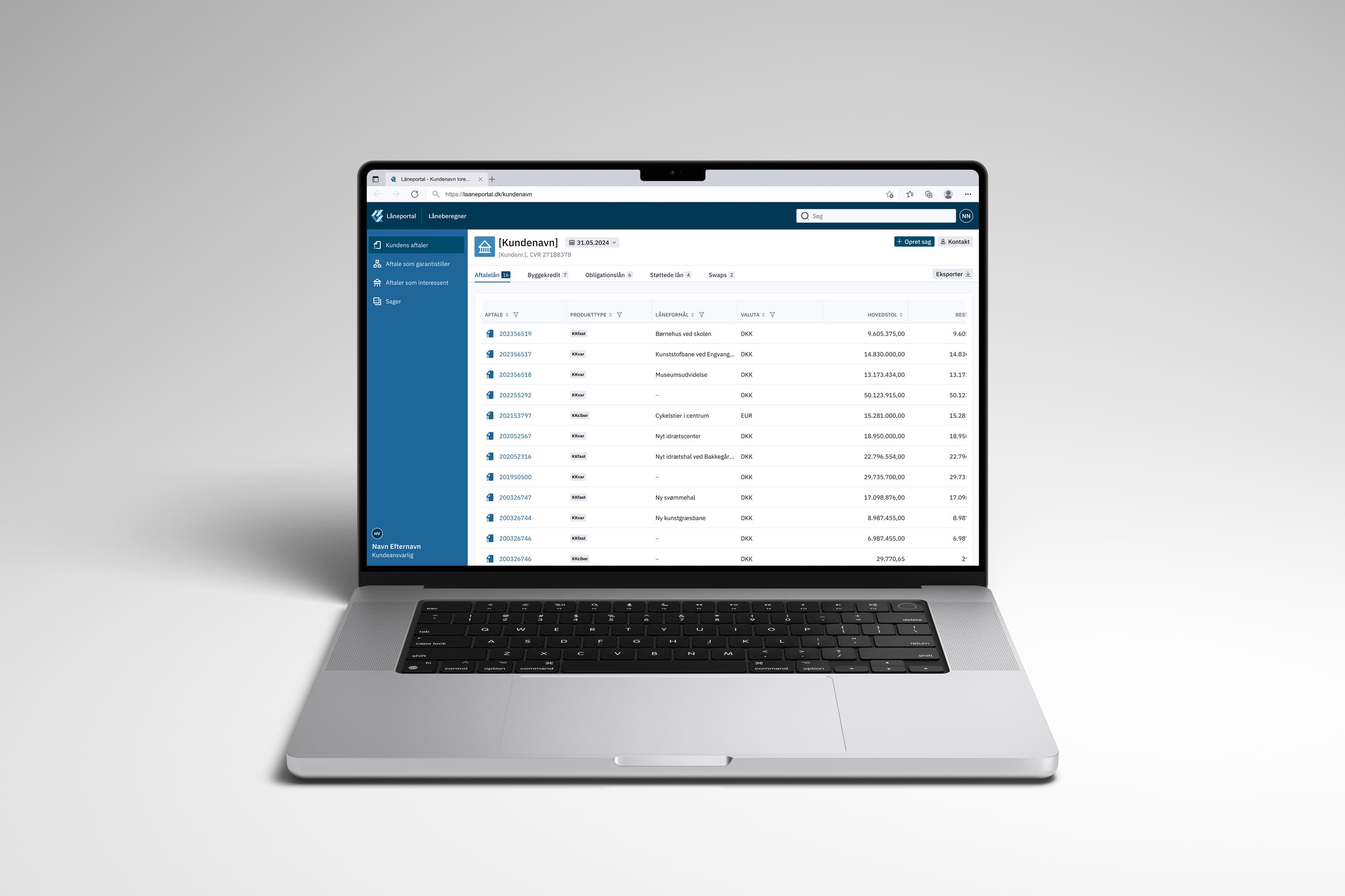
KommuneKredit has been providing financing for Danish municipalities and institutions since 1899. They approached Charlie Tango for an internal loan tool, but over the course of the engagement, the scope expanded to include a full visual refresh. The existing identity was imbalanced in its colour system, dated in its visual expression, and hadn't been built for digital use.
The brief was to modernise without losing the credibility and trustworthiness the brand had built over more than a century.

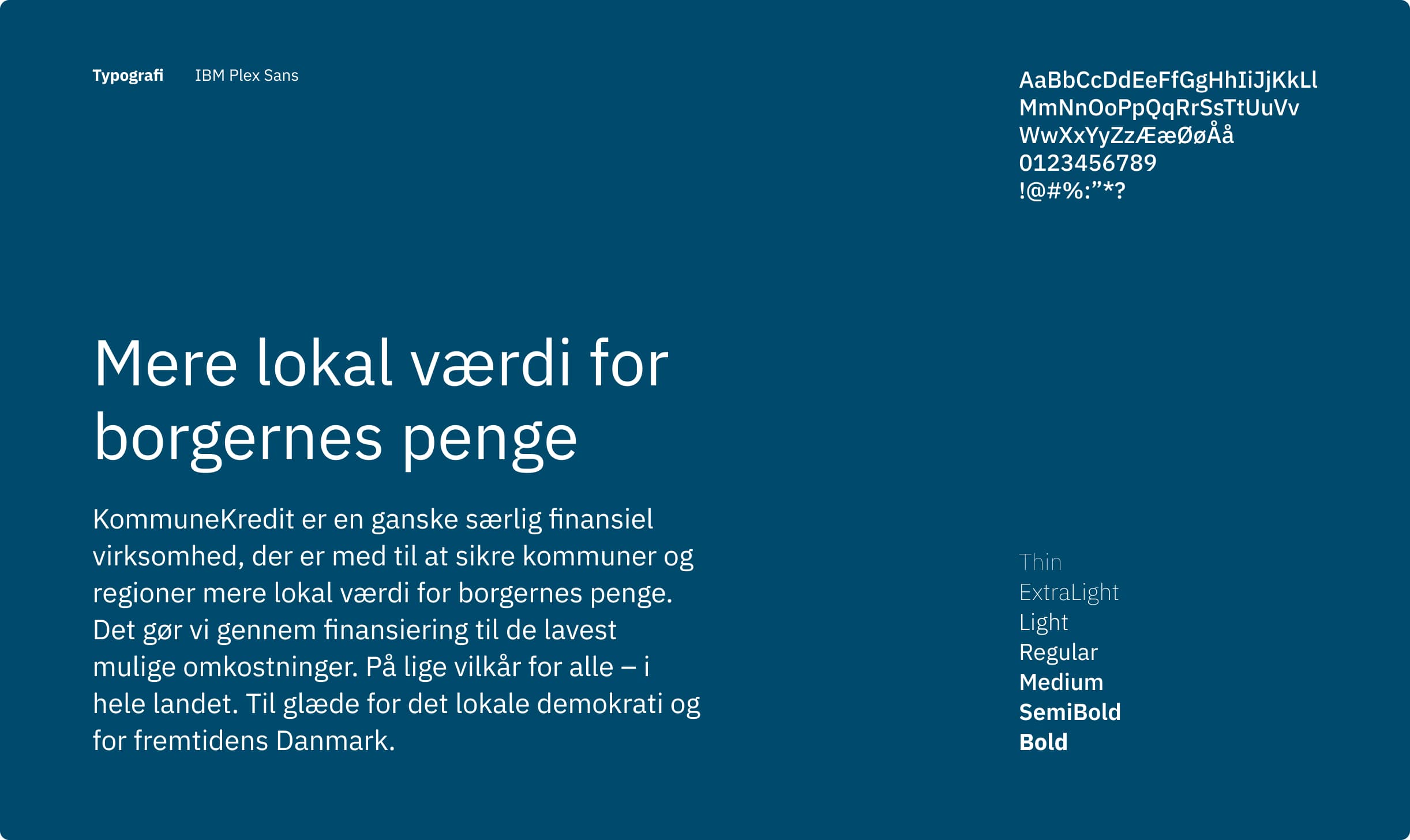
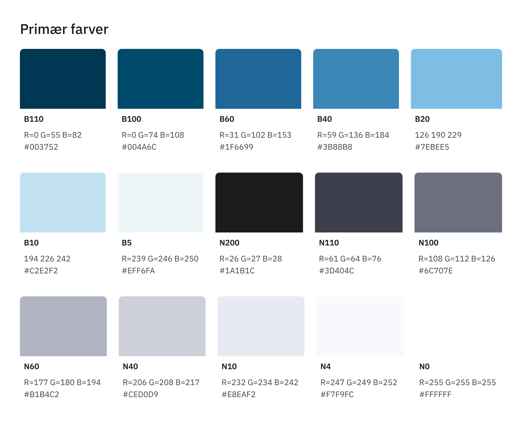
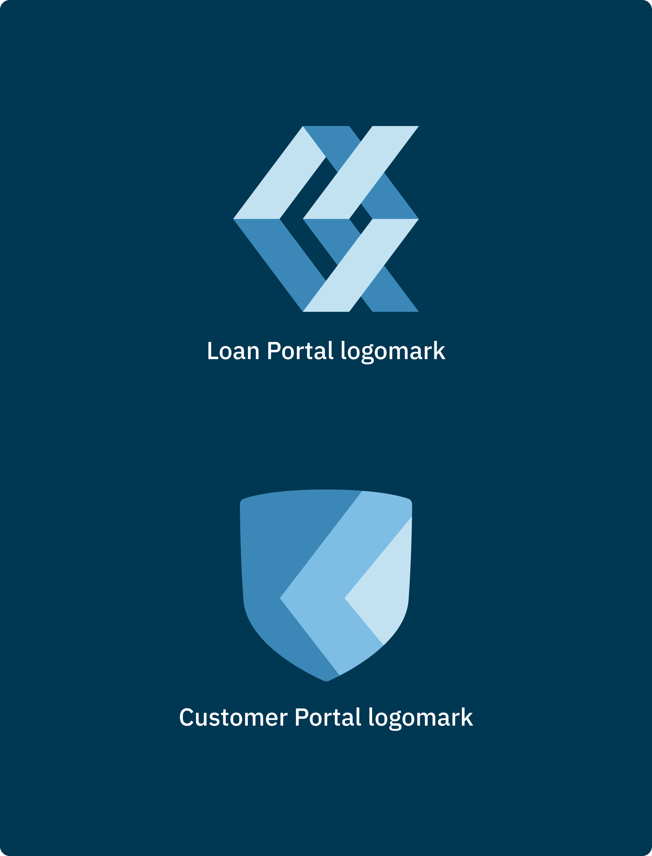
I led the visual design process end to end. That meant running stakeholder workshops to establish brand direction, facilitating keyword and expression exercises, defining five design principles (Modern, Balanced, Elegant, Compact, Effective), designing two new logos, rebuilding the colour system from an imbalanced legacy palette, selecting typography suited to both data-heavy interfaces and marketing, and redesigning the icon library for scalable digital use. I also designed the theming strategy across all three digital platforms.


CONTACT