EyeEm was evolving from a photography startup into a creative platform with a growing commercial presence. Product and marketing had been moving in parallel, each with their own visual language. I built the shared foundation that brought them together.
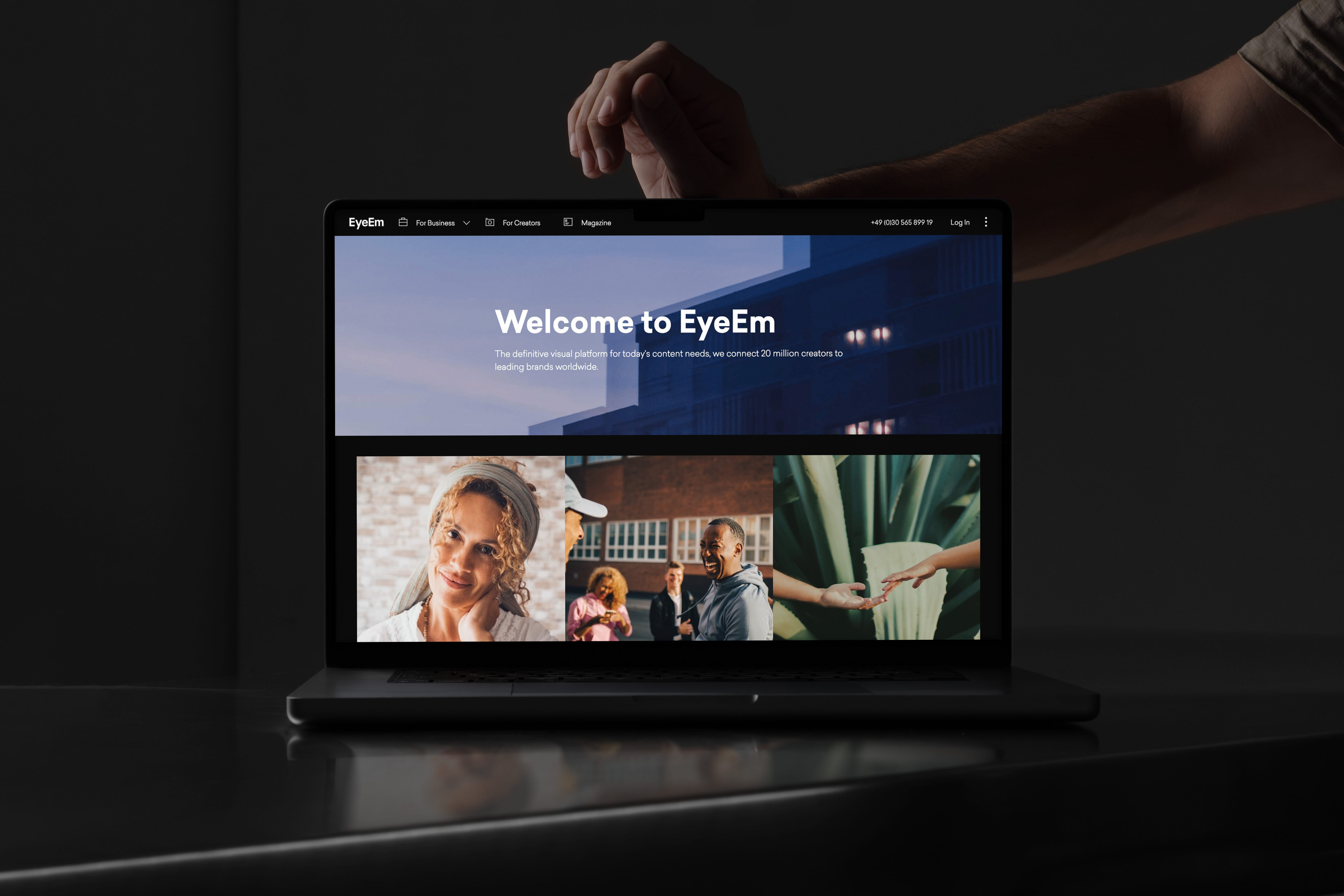
EyeEm was repositioning from a photography community to a premium creative marketplace, connecting brands with a curated community of photographers globally. The product and marketing teams had been growing quickly but separately, each with their own look, feel, and rhythm. For users, this meant a fragmented experience. For teams, it meant duplicated effort and missed opportunities to build recognition.
The brief was a shared visual foundation strong enough to unify product and brand, simple enough to use across teams, and flexible enough to support creative expression.


I led the development of a visual identity system grounded in EyeEm's core values: creativity, connection, and community. That covered typography, layout, and grids for responsive UI and content, colour, imagery, and iconography for cohesion without constraint, and templates and tooling to support both campaign work and product design.
Alongside the rebrand, I designed and built a web component library in Webflow used to launch core pages including the Homepage and About section.
Campaign work had its own demands, so I also created a custom Campaign Builder: a fully configurable landing page system powered by Webflow CMS, giving the content marketing team full ownership over page creation while keeping the brand consistent. I documented everything on a dedicated internal design portal, so designers and non-designers alike could get up to speed quickly.


CONTACT


